Achieve3000
Adolescent Literacy Paper
Achieve3000® provides a suite of digital solutions for literacy growth and learning for students in PreK-12. Understanding the importance of quality graphic design for the education market, they actively incorporate it into their marketing plans. Achieve3000 hired Pritchard Design to strengthen their overall brand.
Focus
This paper communicated the need for more focus on adolescent literacy and how Achieve3000 helps students excel. The audience for this piece was teachers and educators, potential users of the Achieve3000 system.
Readability
Pritchard Design used the vibrancy of the adolescent perspective as a jumping-off point for design. With brightly colored headlines, sidebars, and lively images, the information is easy to read and compels the reader to follow.
Education Design
Distinctive design for education attracts customers and also helps engage students and inspire educators. Pritchard Design understands the importance of making educational materials attractive and engaging, as well as organized and readable.
More for Achieve3000

Intervention Teacher’s Guide
The Achieve3000 Teacher’s Guide was one of two 300+ page books designed and produced by Pritchard Design. Layouts using white space, callouts, graphics, and chapter organization make the information clear and straightforward for use in teacher planning.
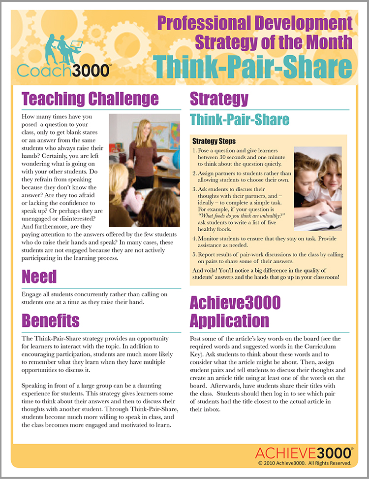
Professional Strategy of the Month Information Sheet
Pritchard Design designed the Professional Development Strategy of the Month paper to demonstrate how the Achieve3000 system could help solve a specific teaching challenge. We continued the Achieve3000 brand, keeping the visuals engaging.
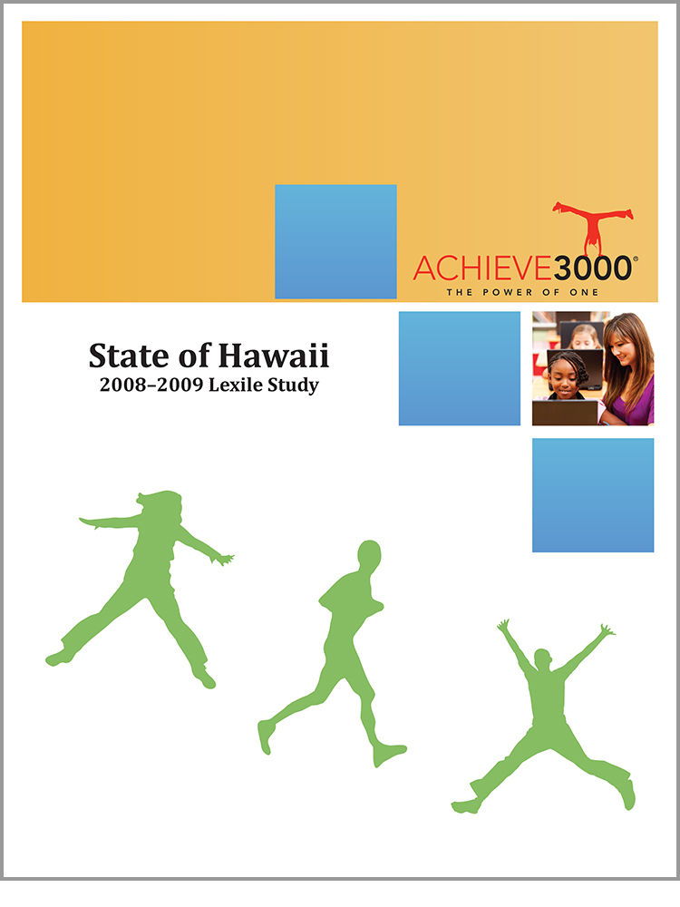
State Studies
Success Studies, specific to each school, present progress and statistics about changes after using Achieve3000 programs. As informational pieces, they were designed to be more oriented toward data presentation, yet still incorporating the brand colors.
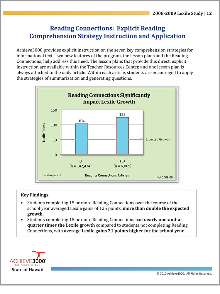
Achieve3000’s stated focus on data allowed Pritchard Design to rely on one color in the interior of these booklets, resulting in lower cost production without sacrificing impact.